Logo and Crest
Follow the timeline below to find out about the changes, additions and uses of Adelaide Football Club’s official logo and crest since the start of the Club in late 1990.
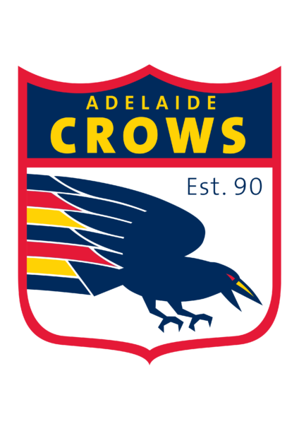
The new Club’s first brand decisions were made in a whirlwind of meetings between the Interim Board, marketing committee, external agency, SANFL and AFL. Adelaide’s original Crows logo in the official colours of red, navy blue and gold was set inside a shield. The text accentuated “Crows” rather than “Adelaide”. The Crow was used by itself in some circumstances. All AFL clubs also had a caricature version of their logo. Adelaide’s first marketing committee also developed an official club coat of arms, to be used on formal occasions. The latin motto Natus Ad Magna Gerenda translates to “Born To Be Great” or “Born To Do Great Things”. This crest appears on the gold Club Champion jackets, official documents including Hall of Fame certificates and several AFL heritage guernseys.
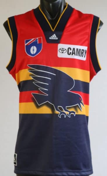
The first change to the main club logo was for the 1996 season when the emphasis on the name switched to “Adelaide”. The AFL approved the change in April. The Club also launched a new unofficial logo incorporating the map of South Australia and Camry Crow with the words “The Team for all South Australians”. A version of the Crow appeared on the front of the Club’s first new guernsey style, used in 1996, 1997 and 1998 pre-season games.
By the end 1998, the Shield background was on the way out and the official logo featured the Crow, by itself or above “Adelaide Crows”, using a new typeface. The Shield version still appeared on some club material, membership items and merchandise. For the first time in the Club’s history a new jumper design featuring the Crow was worn for away games.
The official crest first appeared on a jumper in 2004. It featured on the front of the Club’s first heritage round guernsey, worn in round 18 2004. The monogram from the crest then appeared on the front of the 2005 gold-based heritage jumper, worn in the round 20 Showdown and then on later heritage style jumpers.
It was at the end 2009 when the first major change to the original logo was made at the same time as the club moved into the redeveloped training facility ahead of the 2010 season. The new Crows head featured on the front of a new away guernsey for the next three seasons. The Club also reinstated a version of the original Shield style logo for official purposes. It was used as the base for the commemorative 20th year marketing logo in 2011 and also appeared on the 25th season logo (with the crest monogram) on the back of 2015 guernseys. The crest appeared on the back of the club’s SANFL guernsey from 2015-22.
In 2024, Adelaide temporarily changed its name to Kuwarna in a celebration of Indigenous culture and heritage during the AFL’s Sir Doug Nicholls Round, AFLW’s Indigenous Round and SANFL’s First Nations Rounds. Kuwarna (pronounced goo-wun-na) is the Kaurna translation for the word Crows and has been used in consultation with the Kaurna Warra Karrpanthi Language Corporation. As well as being referred to as Kuwarna, the Club displayed a new version of the logo, designed by Aboriginal artist Harley Hall.
Adelaide unveiled a new logo late in 2024 as part of a Club-wide rebrand to prepare for the move to Thebarton Oval. The new design features a nod to the Club’s heritage by reverting to the original ‘swooping’ Crow style. The word ‘Adelaide’ now solely sits below the crow.


